CNN Fear & Greed Index 2026-07-28
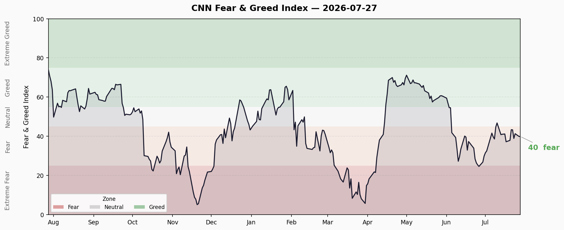
Composite 39.94 (Fear), +0.51 from prior close. 7 sub-indicators: 1 Greed / 3 Neutral / 3 Fear / 0 Extreme Fear. VIX 18.67 neutral, Put/Call 0.822 defensive. Credit spreads normal, yield curve slightly positive. Margin debt at record $1.304T.
CNN Fear & Greed Composite
| Metric | Value |
|---|---|
| Composite | 39.94 / 100 |
| Rating | Fear |
| Previous Close | 39.43 |
| 1 Week Ago | 37.94 |
| 1 Month Ago | 24.66 (Extreme Fear) |
| 1 Year Ago | 74.66 (Greed) |
Composite +0.51, third consecutive session in lower Fear territory. The last 10 sessions have oscillated in the 37-44 range, centered around 40, with no clear directional signal. Compared to the Extreme Fear trough of 24.66 a month ago, the index has recovered significantly (+62%), but remains far from the Greed reading of 74.66 seen a year ago.
Notably, the S&P 500 sits at all-time highs (~7413) while sentiment remains pinned in Fear. Record highs + fearful sentiment = classic “climbing the wall of worry” setup.
Sub-Indicator Breakdown
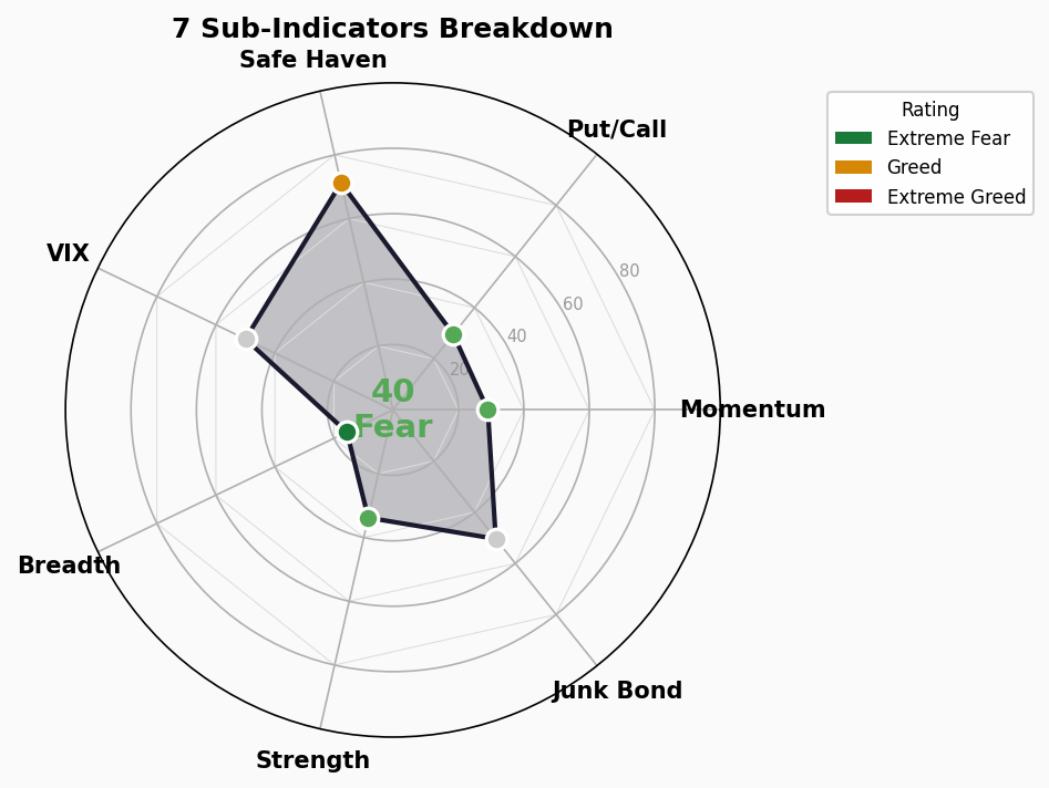
1. Stock Price Strength — 33.8 Fear ⬇️
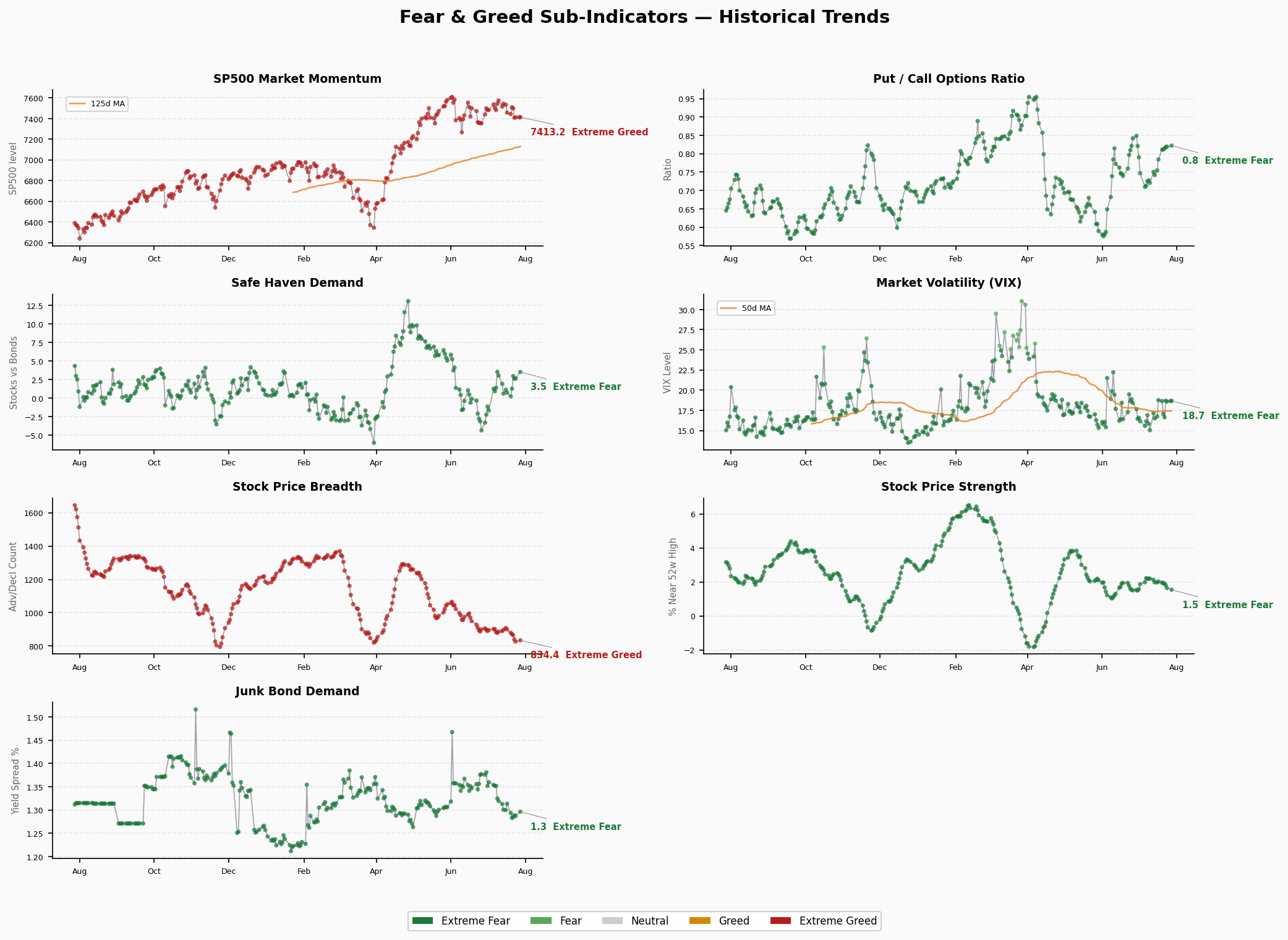
52-week high/low ratio. Latest 1.545, prior 1.646, deteriorating.
New lows are increasing, market breadth is contracting. While the index sits at highs, individual stock momentum is weakening. This is one of the most noteworthy caution signals.
2. Stock Price Breadth — 15.6 Extreme Fear ⬆️
McClellan Volume Summation Index. Latest 834.39, prior 826.59, improving.
Despite remaining in Extreme Fear territory, volume breadth is improving marginally, suggesting buyers are stepping in on dips. This indicator often leads price turns.
3. Market Momentum — 29 Fear ➡️
S&P 500 vs 125-day moving average. S&P 500 at 7413.18, essentially flat.
The index remains above its 125-day MA, but the deviation is narrowing. Momentum score has fallen from Greed into Fear, signaling slowing upward velocity and a consolidation phase.
4. Put/Call Options — 29.6 Fear ➡️
Latest 0.822, prior 0.819, essentially unchanged.
Elevated put/call ratio indicates persistent hedging demand. A reading of 0.82 suggests market participants remain cautious about downside risk.
5. Market Volatility (VIX) — 50 Neutral ➡️
VIX at 18.67, unchanged. VIX 50-day MA at 17.43.
VIX oscillating in the 18-19 range — neither panicked nor complacent. Historically moderate, not an alarm but doesn’t support aggressive positioning.
6. Junk Bond Demand — 50.4 Neutral ⬆️
High-yield vs investment-grade spread. Latest 1.296, prior 1.287, improving.
Credit market sentiment is neutral-positive. Narrowing spreads indicate stable risk appetite. This mildly diverges from equity Fear — the bond market is more sanguine than the stock market.
7. Safe Haven Demand — 71.2 Greed ⬇️
Stock vs Treasury relative strength. Latest 3.543, prior 2.669, deteriorating.
Greed reading means capital is still flowing toward equities over bonds, but the sharp decline from 2.669 to 3.543 (note: higher = less safe haven demand) may reflect single-day flow anomalies.
Structural Divergences
Extreme Readings
- Stock Price Breadth 15.6 — Only sub-indicator in Extreme Fear. Volume breadth severely contracted but improving at the margin, potentially a bottoming signal.
- Safe Haven Demand 71.2 — Only sub-indicator in Greed. Capital prefers equities, creating an interesting contrast with overall Fear sentiment.
Divergence Signals
- Price vs Sentiment: S&P 500 all-time highs ↔ FNG 39.94 Fear. The most striking contradiction — prices at records while sentiment remains fearful.
- Credit vs Equity Sentiment: Junk Bond Demand neutral-positive (50.4) vs equity Fear (39.94). Credit markets are calmer than equity markets.
- Breadth vs Index Level: Stock Price Breadth Extreme Fear (15.6) vs S&P 500 all-time highs. The rally is concentrated in large caps; small caps and most individual stocks lack participation.
Overall Assessment
Classic “wall of worry” configuration. High index, fearful sentiment, contracting breadth — not necessarily a top signal, but indicates the rally’s “quality” is questionable. If breadth doesn’t improve, correction risk increases.
🚨 Crisis Precursor Dashboard
1. Credit Spreads
- HY OAS: 2.79% | 🟢 Normal/Greed
- IG OAS: 0.80% | 🟢 Normal
- Trend: Credit spreads at historical lows, no stress signals
- Data as of: 2026-07-24 (FRED)
2. Yield Curve
- 10Y-2Y Spread: +34bp | 🟢 Normal (slightly flat)
- 10Y: 4.69% | 2Y: 4.33% | 30Y: 5.16%
- 10Y-30Y Spread: -47bp (long-end inversion persists)
- Assessment: Short-end slightly positive, long-end still inverted. Not a crisis signal.
3. Margin Debt
- FINRA Margin Debt: $1.304T (April 2026) | 🔴 Record high territory
- Assessment: Margin debt at extreme historical levels implies elevated market leverage. Forced liquidation cascade risk in a sharp drawdown is the most notable tail risk to monitor.
4. IPO Market
- 2026 YTD IPOs: ~73 (Renaissance Capital estimate) | 🟡 Moderately active
- Assessment: IPO count moderate, not showing 2021-style frenzy. Not an overheating signal.
5. Fund Flows
- 2026 YTD ETF Net Inflows: $856B | 🔴 Record high
- Assessment: ETF inflows at all-time records reflect sustained retail and institutional buying. Historically, flow peaks often coincide with market tops — worth monitoring but not an immediate reversal signal.
Composite
| Indicator | Status |
|---|---|
| Credit Spreads (HY OAS) | 🟢 Normal |
| Credit Spreads (IG OAS) | 🟢 Normal |
| Yield Curve (10Y-2Y) | 🟢 Normal (flat) |
| Margin Debt | 🔴 Record High |
| IPO Activity | 🟡 Moderate |
| ETF Inflows | 🔴 Record |
3 🟢 / 1 🟡 / 2 🔴
Conclusion: Credit markets and the yield curve are not flashing crisis signals. However, margin debt and ETF inflows are both at historical extremes, indicating elevated leverage and capital enthusiasm. This is not an “imminent crash” signal, but implies heightened fragility if an external shock materializes (policy shift, geopolitical risk, etc.). The rational stance: ride the trend but don’t loosen risk controls.